Butter Wine launches Portfolio-wide Packaging Redesign

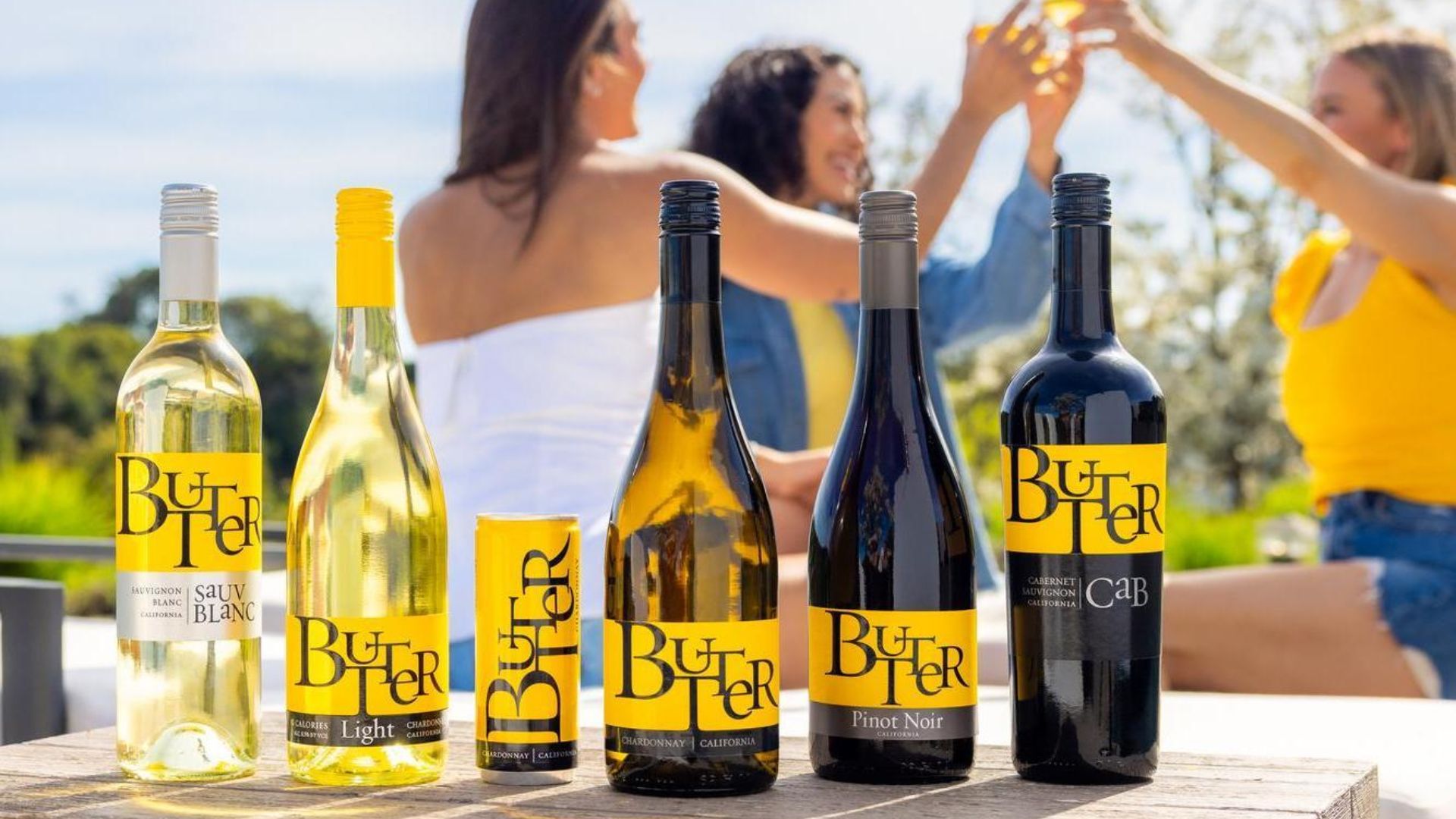
Photo credit: John Anthony Wine & Spirits
In the fourth edition of our Beverage Packaging Redesigns of 2025 series, we dive into a recent packaging redesign by Napa Valley-based Butter Wines (owned by John Anthony Wine & Spirits).
Butter Wines started operations in 2010, with their flagship product the famed Butter Chardonnay. According to Nielsen, Butter’s Chardonnay was the second best-selling chardonnay “above $12” in the United States in the year 2021. Though their wines taste great and are relatively affordable, Butter’s packaging design and branding has been a key driver of their growth over the last decade.
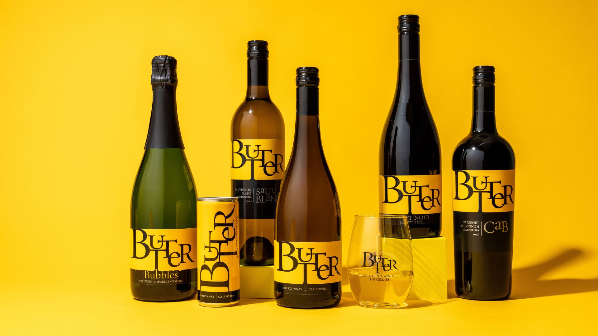
With the success of their Chardonnay variety, Butter launched several other versions including a Sauvingon Blanc, a Cabernet Sauvingon, a Pinot Noir, and more. Since 2010, Butter has disrupted store shelves with a vibrant yellow label and playful typography (see image above).
The 2025 redesign was catalyzed by the expanded portfolio and consumer confusion over the similar bottle shapes and color of the past design. John Anthony Wine & Spirits Chief Creative Officer, Liza Butler, was quoted in a Packaging Digest article stating:
“As the demand for more varietals accelerated, with Butter Pinot Noir and Butter Sauvignon Blanc, we noticed confusion at the shelf. This was our opportunity to take a step back and revisit the entire portfolio.”
The image below is of the packaging prior to the 2025 redesign. It’s hard to distinguish between the shades of color—they’re too similar—and the labels indicating different varieties do not pop like they could (e.g., “CAB” on the far right).
Additionally, the caps are relatively the same and varieties are only distinguishable by a slight difference in tinting—making it hard for consumers to find their favorite when in a hurry.
The new features of the portfolio-wide redesign include:
The use of lighter glass across all varieties, contributing to sustainability and cost savings
A reduced label size across all varieties, further contributing to sustainability and cost savings
For the Cabernet Sauvingon: minor changes including higher shoulders and a slight change in typography so the word “Cab” sticks out
For the Pinot: a new grey colored cap and a similarly colored grey background behind the words “Pinot Noir” for differentiation from other varieties
For the Sauvignon Blanc: a new shiny glass with a silver cap and new silver label to help the words “Sauv Blanc” stick out on store shelves
For the ButterLight Chardonnay: a new light colored glass with a yellow cap and a new label to distinguish it from the regular Butter Chardonnay
For the Butter Chardonnay: minimal changes including increasing the name on the label for increased visibility
To get a closer look at the redesign, lets compare the previous Sauvignon Blanc design to the refreshed design:
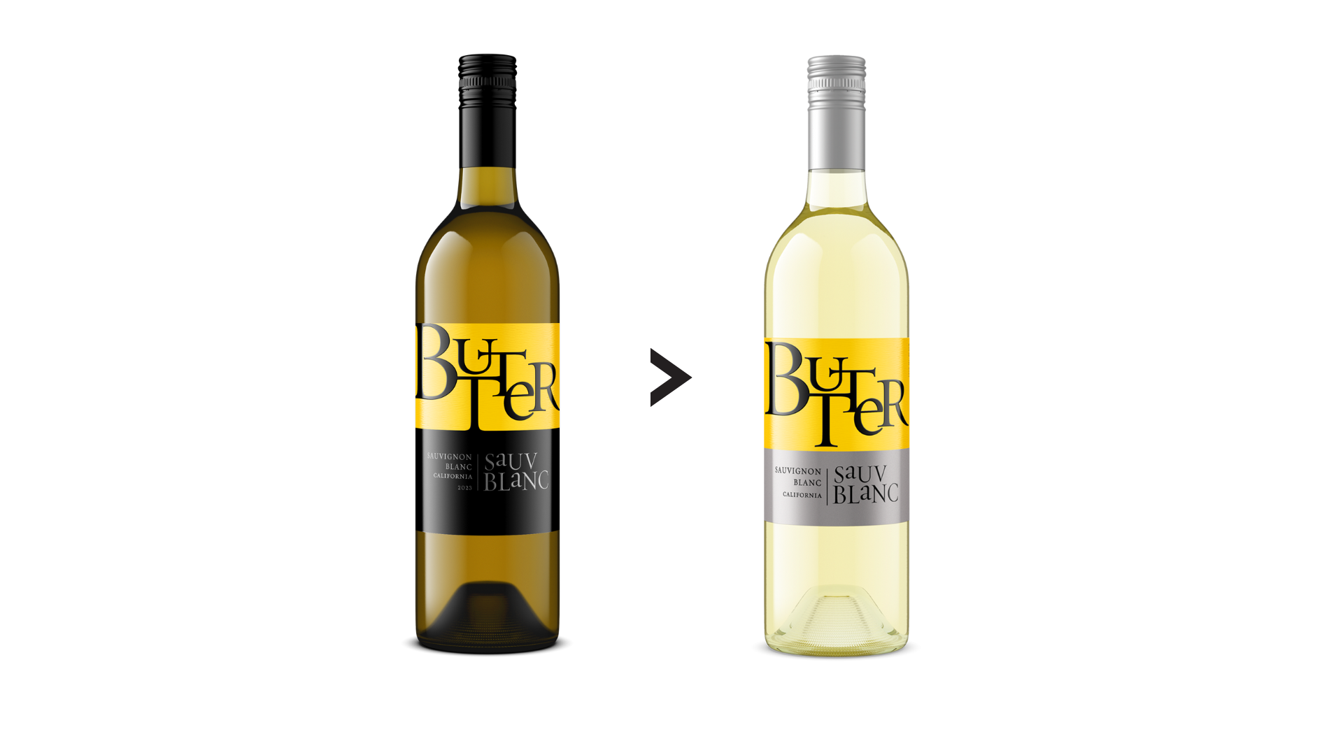
As we highlighted above, not only do the clear design changes help different varieties attract attention on store shelves but also ensure the team at John Anthony Wine & Spirits hits their marks on sustainability goals with lighter glass and smaller labels.
Speaking on the new lightweight bottles in Packaging Digest, Liza Butler stated:
“Choosing lighter glass was a win-win for the planet, the consumer, and the winery, to improve sustainability and cost efficiency. It was a natural lever to pull and also served as another point of differentiation across varietals through the choice of different glass weights.”
Similar to the bottle weight, Butler also highlights that the reduced label size has benefits for cost and sustainability.
Read more on Butter Wines portfolio-wide redesign here.
Learn how to redesign your packaging for sustainability
As the team at Butter Wines demonstrated with their recent portfolio-wide redesign, baking sustainability considerations into your packaging redesigns can help your products stand out on store shelves, cut costs, and meet company-wide sustainability goals.
Packaging is not just a “silent salesperson”—it’s a tangible representation of your brand’s sustainability commitments and progress. Without drastically changing their brand image and packaging, Butter Wines delivered a fresh new look with major sustainability (and cost!) savings.
And the same can be true for your brand’s packaging design! The first step? Having a grasp of how to navigate the trade-offs of different packaging decisions from a design and environmental impact perspective. To help with that, the Packaging School has developed a number of programs in packaging designs, redesign, and sustainable packaging.
Interested in learning how to navigate the sustainability trade-offs of different packaging substrates, processes, and design choices, along with receiving hands-on training with life cycle assessment software? Check out our 40-hour online certificate program—the Certificate of Sustainable Packaging.
Already have a grasp on sustainability and technical packaging topics but want some training on redesign best practices instead . . . we have you covered there too! Check out our newest online program—reDesign Your Package.
By signing up you indicate you have read and agree to our Terms of Use. Packaging School will always respect your privacy.