V8 Energy Launches New Packaging Design to Appear More "Health-Conscious"

At the end of October 2025, V8 Energy (a Cambpell’s Company brand) was featured in Packaging World for their recent packaging redesign focused on increasing the brand's shelf impact and establishing a “health-conscious positioning” in the energy drink space.
The move makes sense, as (according to their site) Campbell’s V8 Energy:
Provides “steady energy from black and green tea”
Contains “80 mg of caffeine”
“Supports focus” and offers a “combined serving of fruit and veggies”
Is “packed with B Vitamins” and is a “good source of Vitamin C”
Has only “50 calories per 8 oz serving with no added sugar”
Not many energy drinks can make claims like this, and V8 Energy and Campbell’s felt it was time the packaging reflected the health benefits of the product.
Unlike other redesigns we highlighted in the Beverage Packaging Redesign index, including Lipton, vitaminwater, and Brew Dog, the V8 Energy and Campbell’s team decided to execute the redesign in-house, without the aid of a design agency.
In Packaging World, Cory Brookes (Senior Design Manager at Campbell’s) stated:
"After initial rounds of design conceptualization not meeting the creative brief, the decision was made to direct the design strategy and execution in-house. This proved to be a success, allowing the V8 Energy team to work more nimbly and effectively, delivering creative that was on time, under budget, and on brief."
The packaging redesign was conducted across both primary packaging (individual cans) and secondary packaging (multi-pack sleeves). Below is the original multi-pack for the Peach Mango variety compared to the refreshed version:
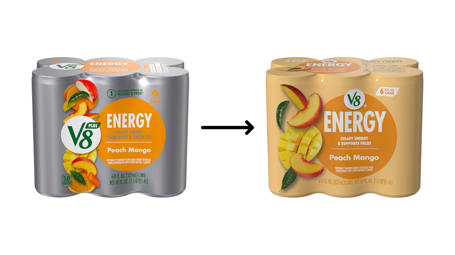
As you can see, new elements include:
Dropping the standard grey background for a background that aligns with each variety (e.g., peach background for Peach Mango multi-packs)
Moving the V8 logo from the center left of the package to the center top
Changing “Steady Energy from Black & Green Tea” to “Steady Energy & Supports Focus”
New simplified fruit visuals and removal of vegetable visuals
A change from the V8 Plus logo to a Standard V8 logo directly above the word ENERGY
Speaking on the redesign in Packaging World, Brookes stated:
"By simplifying fruit visuals and removing vegetable imagery, the new design emphasizes the fruit-forward taste that consumers love, making the packaging as appetizing as the product inside."
To analyze the changes of the primary packaging (individual cans), check out the graphic below showing the Black Cherry variety pre and post redesign:
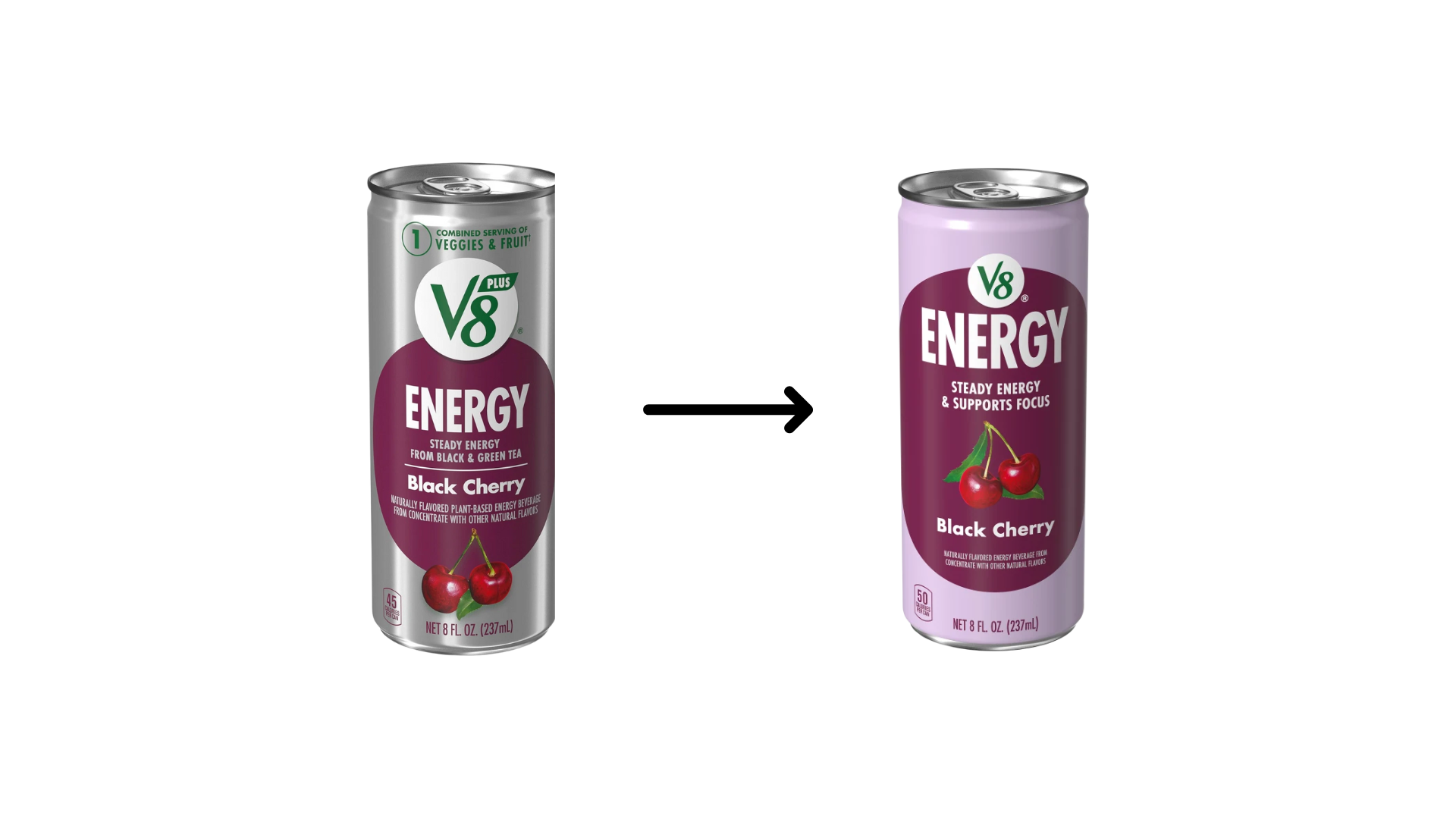
As you can see, similar to the multi-packs, the traditional cans had a standard silver background, included the V8 Plus logo, used phrasing like “Steady Energy from Black & Green Tea,” and had fruit graphics toward the bottom of the can (under the variety name).
The new can design, like multi-packs, have different colored backgrounds based on the variety, an updated V8 logo and placement, the use of the phrase “Steady Energy & Supports Focus,” and updated fruit graphics in a new place—between the variety name and energy and focus support claim.
While the redesign is relatively fresh (taking place in October 2025 and only recently hitting major retailers), Brookes spoke on its efficacy to Packaging World:
"The design updates tested extremely well in consumer packaging design research, especially on metrics like likeability and relevance. The packaging delivers better shelf stand-out, more flavorful and refreshing design cues, and establishes a livelier visual identity brand world for this relevant V8 product line.”
At The Packaging School, we resonate with Brooke’s comments and feel this redesign is a great case study to follow. It delivers strong updates to graphics, messaging, and shelf-impact while holding onto the core brand identity of V8 Energy and not creating a shock for consumers.
The core value proposition was simplified, each variety now has its own stand-out look, and it is bound to disrupt a crowded energy drink planogram—especially with fruit graphics and health claims.
Like all packaging redesigns we cover, our team will be monitoring the V8 Energy redesign to see if it turns out to be a success or falls short in the marketplace—stay tuned for updates.
Read more about the redesign in Packaging World here.
Dive into more beverage packaging redesigns taking place in 2025, including brands like Lipton and vitaminwater, here.
Develop an Internal Framework for Packaging Redesigns
Each packaging redesign or refresh project has its own unique challenges—ranging from balancing stakeholder considerations (both internal and external), budget considerations, navigating partnerships with design agencies, ergonomic and sustainability considerations, and more.
These factors and more make packaging redesigns one of the most cumbersome components of the packaging management process—this rings even more true for consumer packaged goods brands.
Despite numerous hours and capital invested in redesign projects, many brands (including major ones like Tropicana and Costco) often fall short on new packaging design launches . . . leading to a loss of shelf equity, brand equity, and sales.
To help brands navigate the nuances of packaging redesigns, we created a 60+ hour online program designed to help your team develop a framework for redesign projects. The program taps into 70+ human psychology and ergonomic factors and Dr. Andrew Hurley’s (our Founder) experience bringing hundreds of packaging designs to market through consumer testing and biometrics research.
Learn more about the program here.
Questions about the program? Reach out to Dr. Julie Rice Suggs (our Academic Director) at Julie@PackagingSchool.com
By signing up you indicate you have read and agree to our Terms of Use. Packaging School will always respect your privacy.