Lipton's First Logo and Packaging Redesign Since 2014

Lipton's First Logo and Packaging Redesign Since 2014
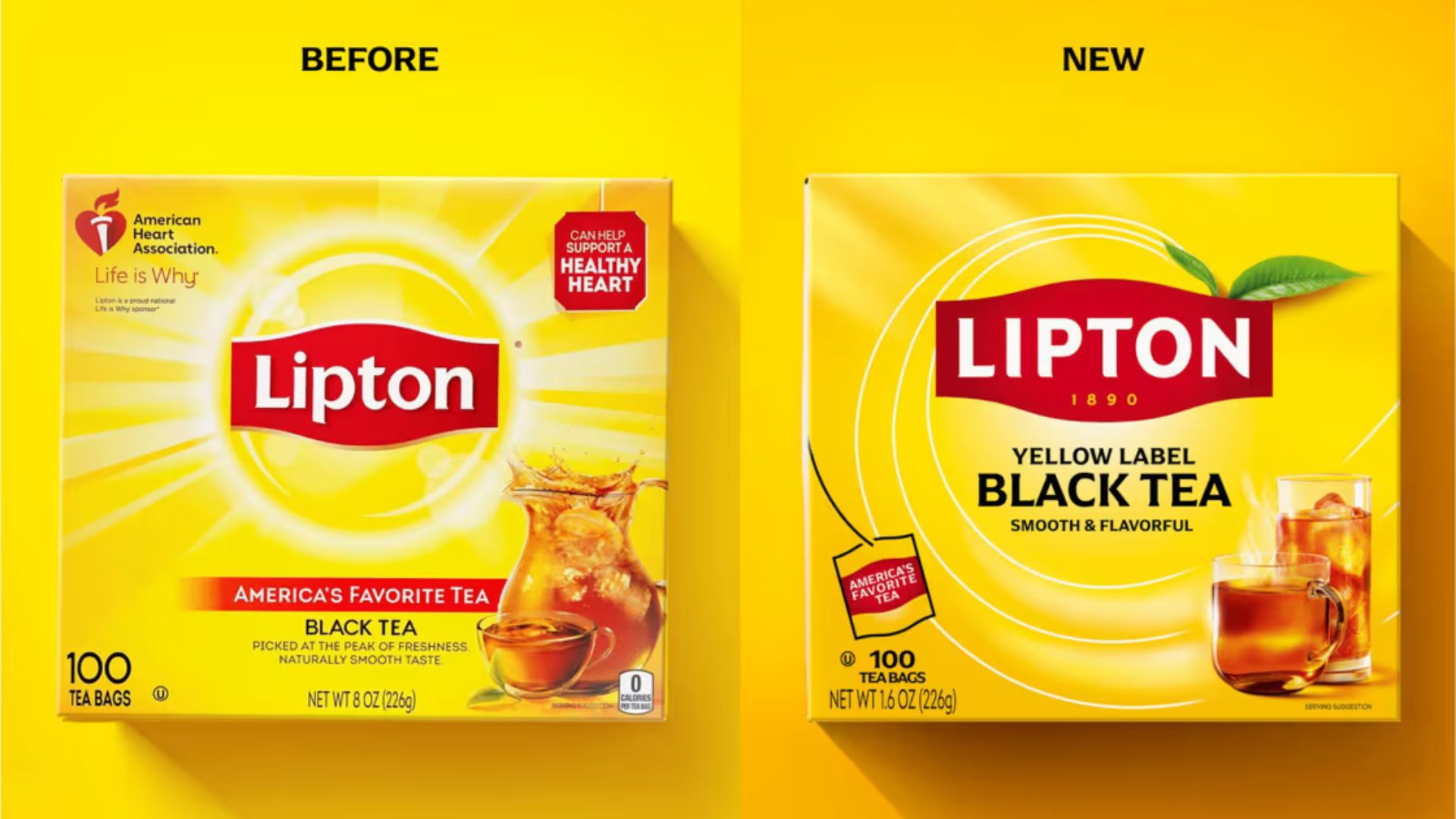
Photo credit: Lipton
To kick off our Beverage Packaging Redesigns: 2025 series, a recent redesign from one of the largest and most celebrated tea companies in the world, Lipton. Since their founding in 1890, now represented on the packaging under their name (shown in picture above on right), Lipton has refreshed their brand image and packaging five separate times—in 1972, 1992, 2002, 2014, and now 2025 (Today).
The redesign of the secondary packaging for Black Tea reveals a number of new elements, including:
A new logo in all caps with the inclusion of “1890” (the year the company was founded)
A less pronounced sun in the background, replaced with 3 swirls and the inclusion of green leaves
Moving “America’s Favorite Tea” to a small teabag on the bottom left of the package
Repositioning and increasing the font size of “YELLOW LABEL,” “BLACK TEA,” and “SMOOTH & FLAVORFUL”
Removal of the iced tea pitcher, replacing it with a glass of iced tea and a new image for the hot tea cup
According to Packaging Digest, who covered the story in May 2025, the year 2025 marks the 135th anniversary of Lipton! To celebrate, they partnered with Paris-based Team Créatif Group to develop a refreshed brand and packaging design for the entire portfolio (both primary and secondary packaging), which is currently sold in 90 markets worldwide.
Sylvia Vitale Rotta, Team Créatif Group Founder & President, was quoted in Packaging Digest, stating:
"The new Lipton identity was designed to celebrate the uplifting power of shared everyday experiences, moments that bring dignity, warmth, and joy to daily life."
Alisa Geller, Brand Director at Lipton, was also quoted in Packaging Digest, stating:
“For a global brand like Lipton, packaging must perform across a variety of markets, shelf formats, and merchandising styles. That’s why the new design was developed to work in both horizontal and vertical orientations.”
The Packaging School team will be monitoring indicators that show the success or failure of this redesign and others, stay tuned for updates!
Read more on the redesign of the world’s largest tea brand here.
Learn more about best practices for Packaging Redesigns
Packaging, for those close to the industry, is often referred to as the “silent salesperson”—a final opportunity for brands to make an impression and potentially close a sale in a crowded retail environment. This is why brands spend countless hours, not to mention dollars, fine-tuning their packaging to ensure it not only protects the products within, but also speaks to the consumer’s values and appeals to their senses.
For a salesperson to be effective, they must reformat their approach and tactics as consumer preference and behavior dictate—the same rings true for packaging design. And packaging redesigns are a way for brands to shift tactics—they are amongst the most important yet challenging aspects of packaging management, especially when it comes to redesigns for food, beverage, and CPG products.
Reinvigorating your brand and packaging with an updated look while maintaining brand identity is no easy feat, with top brands like Tropicana and Costco missing the mark with redesigns in the past few years.
Fortune 500 Brands, designers and marketers, and small businesses all experience challenges navigating the nuances of packaging redesigns. That’s why the Packaging School created a 60-hour online program that guides you through a structured process for redesigns, utilizing a design-forward approach with an in-depth study of 70+ human psychology design tactics.

Learn more about our newest online program here!

By signing up you indicate you have read and agree to our Terms of Use. Packaging School will always respect your privacy.