Top 5 Food & Beverage Packaging Redesigns of 2024

Top 5 Food & Beverage Packaging Redesigns of 2024
Packaging redesign is one of the most important and challenging aspects of packaging management. Cultivating a fresh new look while holding onto the identity of the brand or package is no easy task—demonstrated by packaging redesign horror stories from top brands like Tropicana and Costco.
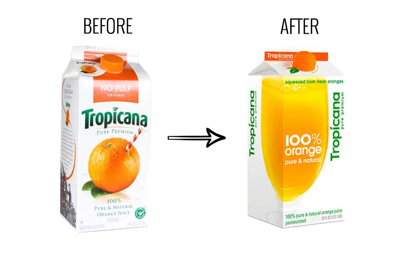
*photo from The Branding Journal
There is no clear-cut formula for a successful packaging redesign, as each case is vastly different. Creating memorable and successful packaging redesigns requires a deep understanding of your brand, the consumer, and the specific packaging system. In this blog, we will explore our top five food and beverage packaging redesigns of 2024, including Impossible Foods, Hostess, 7UP, Jolly Rancher, and Chips Ahoy!
Impossible Foods Goes Red
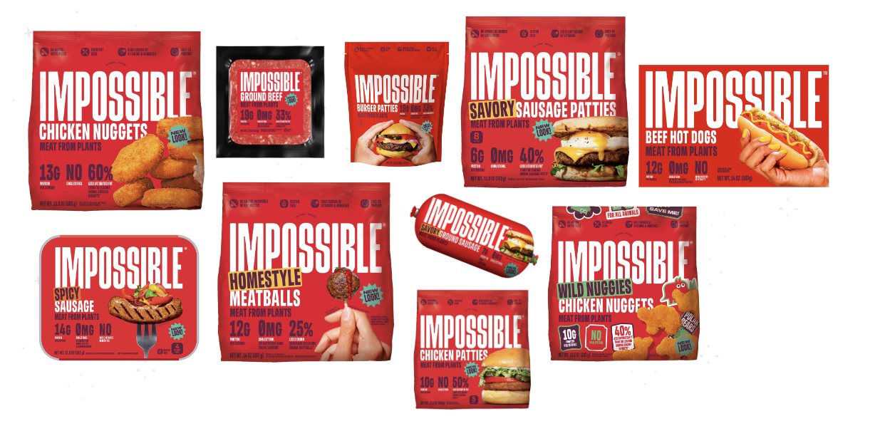
In March of 2024, Packaging Gateway reported that plant-based meat company Impossible Foods was launching a new packaging design for their whole product portfolio, switching from their traditional green and white to a striking red.
According to Impossible Foods, the packaging was changed to red because they feel that it will “perfectly capture the experience of Impossible meat from plants: bold, meaty, delicious.” The move also is part of Impossible’s mission to produce plant-based meat alternatives that rival animal-based products.
Here's the original packaging:
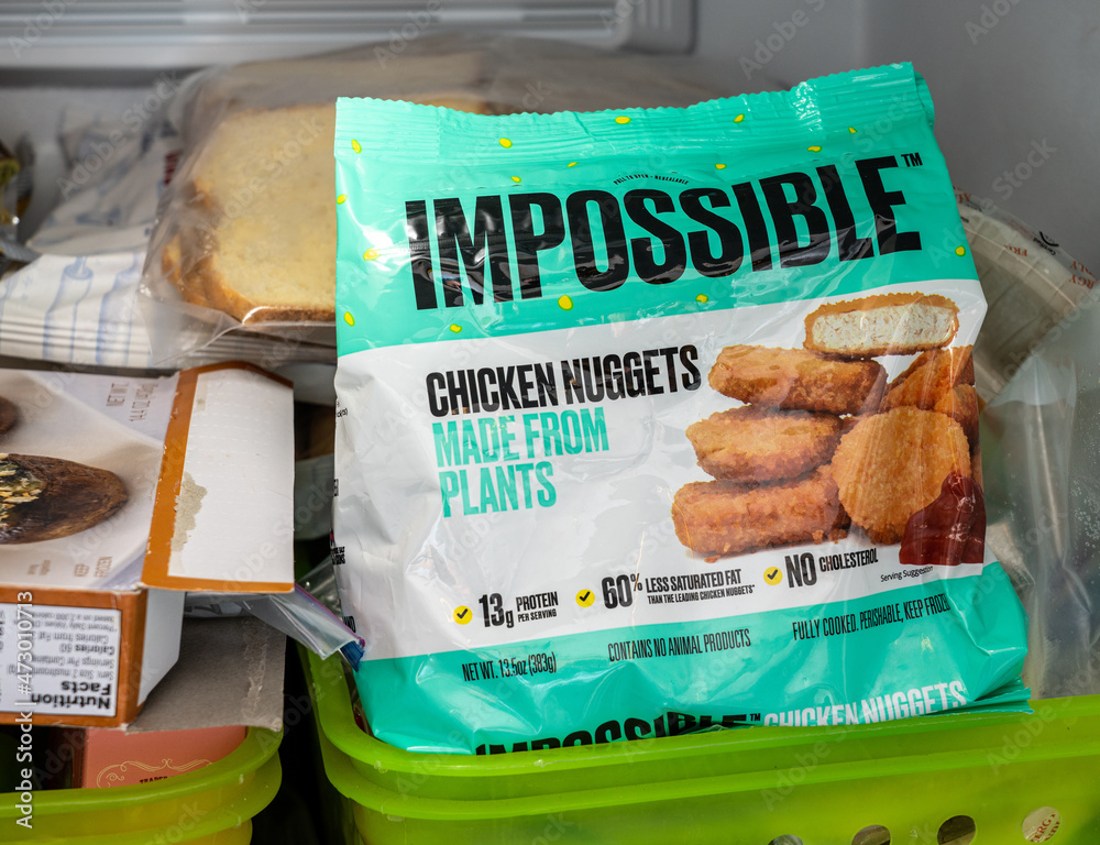
It makes sense that Impossible originally went with a green shade, as it helps communicate their focus on plant-based protein and sustainability. However, CEO Peter McGuinness and the team saw the new packaging (similar to traditional meat packaging) as a tool to reach more consumers who are beyond the traditional plant-based meat market and those who are tired of sustainability messages when shopping. McGuinness was quoted in Packaging Gateway, stating:
“We wanted packaging that lived up to and reflected the deliciousness of our products while popping on the shelf. We want to be inclusive to anyone who enjoys great food. It doesn’t matter if you are a vegan, a vegetarian, an animal meat-lover, or somewhere in between. What we want to do is educate consumers that they can still enjoy meat by incorporating into their diet a version that is made from plants instead of animals.”
We will be actively seeking and monitoring indicators that will show the success or failure of this redesign, so stay tuned for updates.
Read more on the redesign here.
7UP's First Brand Redesign
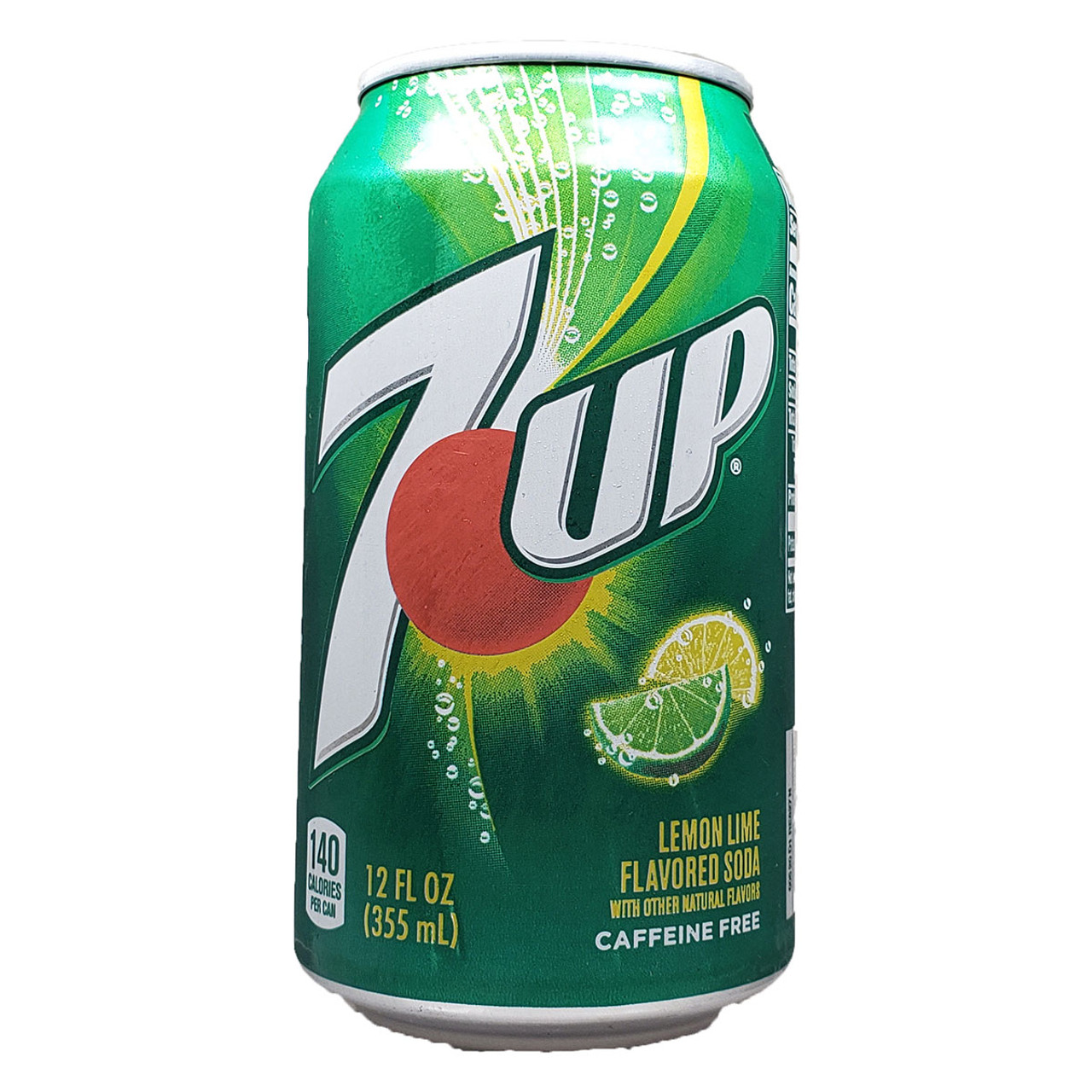
Since 2014
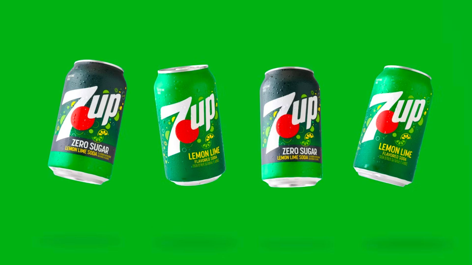
In August of 2024, Packaging Digest reported that Keurig Dr Pepper-owned 7UP was undergoing its first packaging and brand redesign since 2014. Similar to Impossible Foods, 7UP’s recent redesign isn't just for a single SKU, but for the whole product portfolio—from metal cans to PET bottles.
The new packaging, pictured above, keeps the original color palette and core brand elements but adds new, modern components. For example, the previous can design (pictured below) included a swirl behind the logo, a realistic illustration of a lemon and lime, and outlined numbers and letters. The new design removes these elements and replaces them with more “modern” graphics and an artistic rendition of a lemon and lime.
Allison Kapp, the Senior Brand Manager at Keurig Dr Pepper, was quoted in a Packaging Digest article, stating:
“With the new look, it was important to maintain key visual assets like the red dot and 7UP letters while also introducing more modern elements that help evoke the brand’s personality and the uplifting experience of drinking a 7UP. For example, the previous swirl that rose vertically behind the brand logo has been replaced with bubbly effervescence and flavor notes that burst off the package.”
Like the Impossible Foods redesign, 7UP’s upgrade only consisted of design elements, making no changes to the primary or secondary packaging materials. 7UP also decided to stick with green-tinted PET bottles, which it claims were designed to ensure recyclability utilizing the Association of Packaging Recyclers (APR) guidelines.
Despite 7UP claiming alignment with APR guidelines and believing in the recyclability of green-tinted PET, many, including Lisa McTigue Pierce (Executive Editor of Packaging Digest) are frustrated with the continued use of green-tinted PET due to its limited reuse markets. Pierce also cited examples of brands that ditched green-tinted PET with success, including Sprite’s change to clear PET in 2022.
Beyond frustrations with the use of tinted PET, it will be interesting to see if the new brand and packaging redesign make a splash in the marketplace. Stay tuned for updates on the redesign’s efficacy.
Read more on the redesign here.
Jolly Rancher Redesigns Packaging for Entire Portfolio
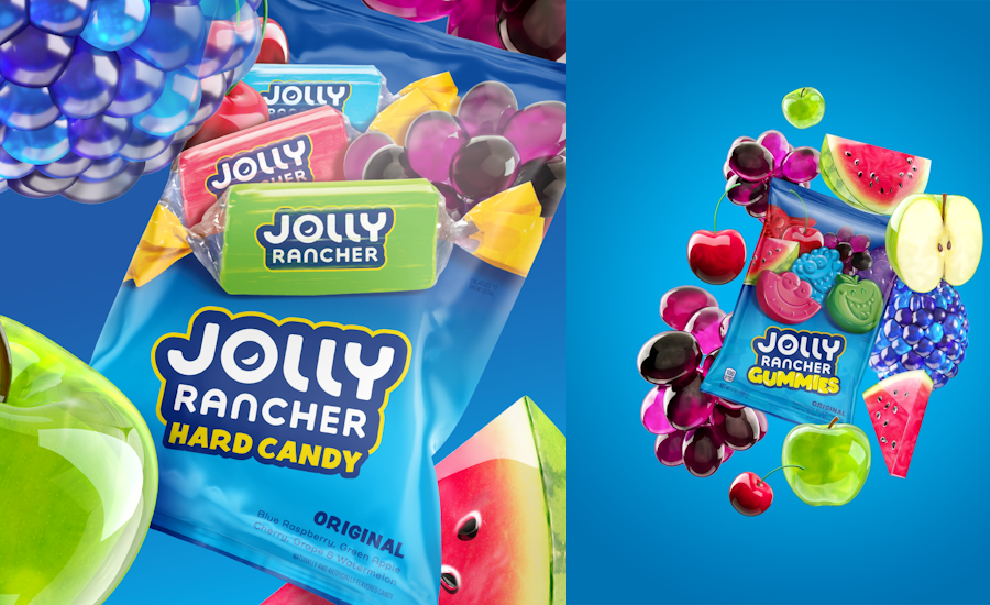
Following the theme of packaging redesigns that expand across entire portfolios, Jolly Rancher, a Hershey Company brand, released a packaging and brand redesign for hard candies, gummies, soft candies, and more in the summer of 2024.
Packaging Digest highlights that the Jolly Rancher team collaborated with design firm Little Big Brands to carry out the redesign. The result was a fresh, favorable packaging design, which was measured by a study conducted by Designalytics showing that 63% of consumers polled preferred the new packaging. Pictured below is the original and revised packaging design, provided by Designalytics:
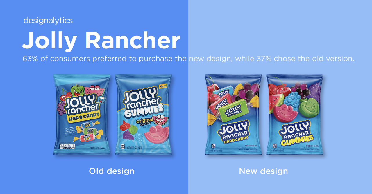
The new design includes an updated logo, new typography and fruit and candy graphics, yet holds to the elements of the Jolly Rancher brand and packaging that make it recognizable.
Richard Palmer, the Executive Creative Director at Little Big Brands, was quoted in Packaging Digest, stating:
“It’s not every day you get to refresh a brand as iconic as Jolly Rancer, one practically synonymous with the hard candy itself. We tackled this challenge by first creating a unified brand identity, bursting with personality. To stand out in the crowded candy aisle, we flipped the script with a unique ‘underside down’ visual architecture that puts the spotlight on the candy and its mouthwatering flavors."
Read more on the Jolly Rancher redesign here.
Chips Ahoy! Packaging Redesign
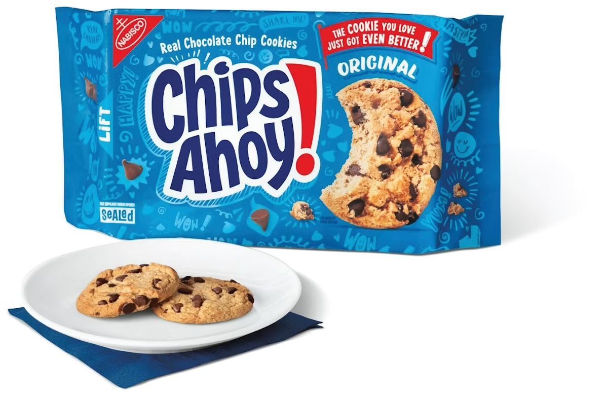
In July of 2024, Packaging World reported that Chips Ahoy!, a Mondelēz International brand, updated its recipe to include new chocolate chips, launched a new gluten-free option, and released new packaging designs for the original and new gluten-free cookies. The updated packaging includes new background graffiti, a new matte color palette, and a refreshed logo.
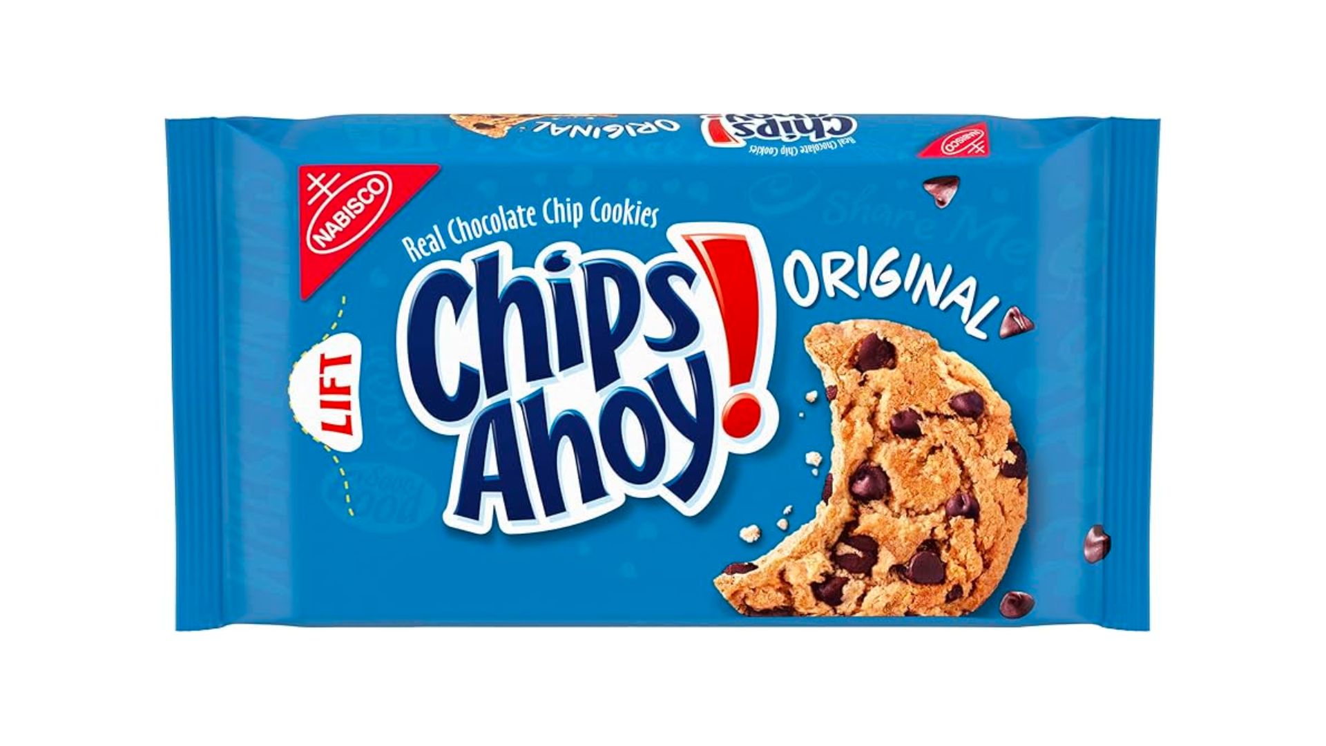
In order to make the gluten-free option easily distinguishable, the packaging team at Chips Ahoy! opted for reversing the primary packaging colors—now the package is light blue on a white background as opposed to white and light blue on a dark blue background.
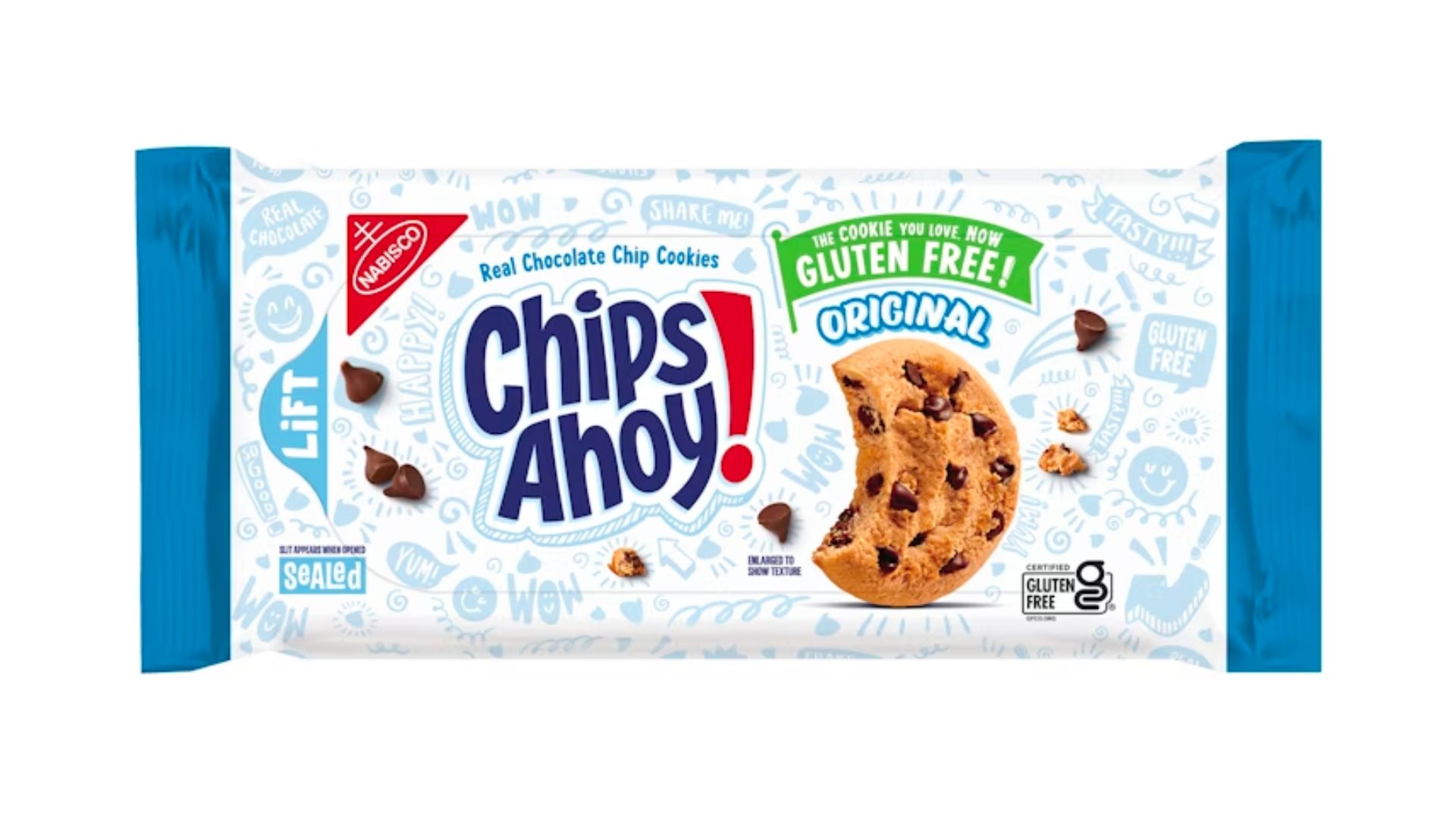
The original packaging is pictured below, and as you can see, the new packaging has an elevated background and graphics—a modern design for an elevated recipe.
Samantha Zellefrow, Global Design Experience Lead at Mondelēz, was quoted in Packaging World saying:
“The overall objective of the Chips Ahoy! pack redesign was to evolve the visual language to be relevant with the target consumer, double down on the taste appeal of the cookie and to communicate the product improvements. We crafted the logo to ensure modernity and boldness against the backdrop. We amped up the graffiti to add personality and visual texture. We photographed our product as the hero on pack to drive the yum-factor. All of these elements work together to deliver an iconic experience at the shelf for our Chips Ahoy! consumers.”
Read more on the redesign here.
Hostess Packaging and
Brand Redesign
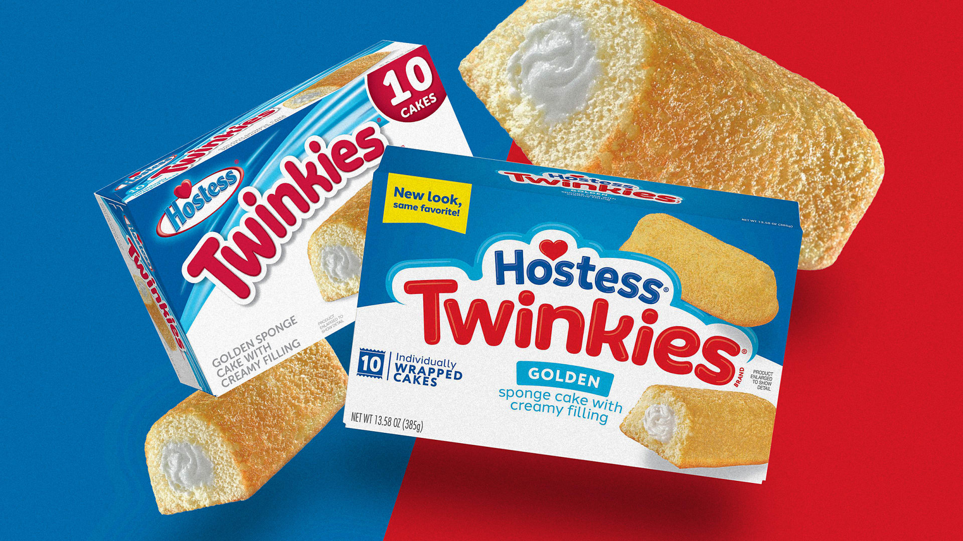
In December of 2024, Hostess partnered with Design Bridge and Partners to undergo the brand's first logo and packaging redesign in 18 years, Fast Company reports. The new logo, front in center in the graphic above, consists of a more simple and modern look—a new font, brighter colors, and a “cloud-like border” that serves to represent the “light and airy quality of every Hostess snack.” Despite changing many components, Hostess kept their iconic heart and color palette to help retain their iconic brand status on store shelves.
The redesign follows the acquisition of Hostess by the J.M. Smucker Company in 2023, a deal worth $5.6 billion USD. With a dip in sales performance a year after the acquisition, J.M. Smucker is keen that the redesign and brand refresh can get Hostess back on track. Read more on the acquisition here.
Fast Company highlights that Hostess carried out the redesign through “multiple rounds of consumer testing,” including using a virtual store shelf and biometrics to measure how the new pack will stand out in retail environments. Similar to how consumers feel about the Jolly Rancher redesign, Hostess notes that consumers prefer the new packaging “two to one.”
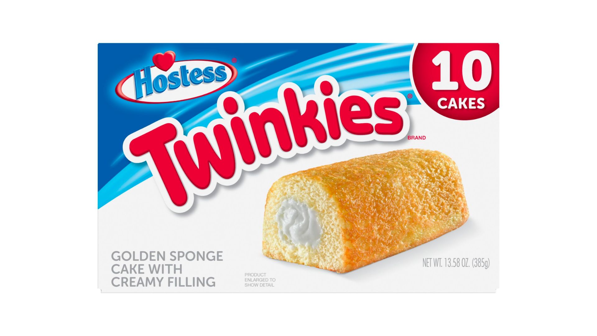
The old packaging for Hostess Twinkies is below. We feel that Hostess did a fantastic job bringing the brand into the 21st century whilst staying true to its historic brand and packaging qualities.
Aundrea Graver, the director of marketing at J.M. Smucker Co., was cited in Fast Company, stating:
“This effort supports our commitments to modernize the brand while promoting the quality and taste that helps differentiate our products. Our goal is to excite current fans to engage with the brand.”
Similar to other redesigns covered in this blog, we will be closely monitoring the success of this redesign—stay tuned for updates.
Read more on the redesign here.
Learn How to Effectively Redesign Your Packaging
As these case studies from Impossible Foods, 7UP, Jolly Rancher, Chips Ahoy!, and Hostess demonstrate, packaging redesign is a complex and tricky, yet necessary part of the packaging development process.
Due to the risks and challenges involved in the packaging redesign process, we are working on a new online program to help train you and your team on the best practices and methodologies in packaging redesign—to ensure your updated designs make an impact on consumers and help write the next chapter in your brand's story. Stay tuned for more information in Q1 of 2025.
In the meantime, check out our suite of packaging design courses and content here.
By signing up you indicate you have read and agree to our Terms of Use. Packaging School will always respect your privacy.